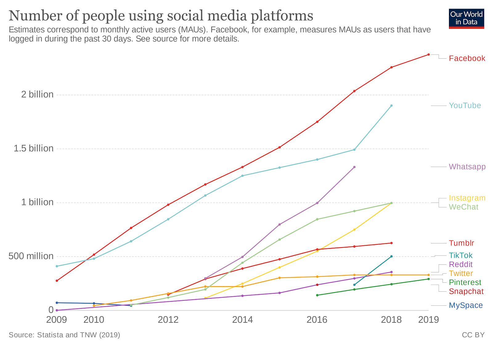
10 years ago in 2010, social media pretty much meant MySpace and Reddit. Now today in 2020, social media means Facebook, Instagram, Twitter, Pinterest, WeChat, TikTok, Tumblr, WhatsApp, Pinterest, Snapchat, and many more.
The sheer number of digital channels isn’t the only thing that’s gained traction faster than a Billie Eilish track on TikTok. Digital adoption has also skyrocketed. Smartphone usage has skyrocketed to such an incredible extent that entire social media features like Instagram messaging don’t even come in desktop form.
People are buried, too. Marketers are fighting for attention in a vast sea of highly-produced brand posts on Facebook, Instagram, and LinkedIn.
It’s enough to make a marketers head spin. How do we keep up with all this? Let’s briefly rewind to look at what happened, and then we’ll talk about how to hustle forward.
Digital Channels Explode
There are 250% more social media platforms in 2020 than in 2010. People are spending 400% more time plugged into social media, too.
Marketing Production Teams are in a Pressure Cooker
The “average” B2B marketer creates content for 10 channels.
10 channels isn’t just 10 channels, either. Marketers are creating content for 4 different audiences on average. All of a sudden, being a “perfectly average” marketer is perfectly overwhelming and you realize just how much scrappiness it takes to stand out in 2020.
That’s 4 audiences multiplied by 10 platforms. Take that number, and multiply it by your publishing calendar.
Crikey, that’s a lot of design.
People are drowning in content.
Let’s rewind to 1970. 50 years ago, the average person 500 advertisements each day. Today, the average person now sees 5,000 brand messages per day. There’s been a 1,000% growth in advertising exposure in a 50-year period, and, you guessed it—a lot of that growth took place in the past decade.
Humans may not have physically evolved too much in the past million years, but human behavior has evolved at an incredible clip in the past decade. Digital exposure exploded, and our attention spans went out the window. Suddenly, we all started downloading ad blockers for browsers. We started ponying up the monthly subscription fee to stream music on Pandora and Spotify without commercials. Marketers’ relationships with consumers has changed beyond recognition.
Digital hasn’t changed literally everything, so don’t despair. It hasn’t changed the definition of good marketing, for example. Just look back at the best marketing advice from the 1960s and 70s for evidence.. People paid attention to things that are interesting and valuable in 1970, and they’re exactly the same way in 2020. The main difference is the staggering decibels of noise from brands people ignore to watch their favorite influencer’s Instagram story or catch up on YouTube subscriptions. It almost makes you long for the days when marketers advertised on billboards and the Jackson 5 made chart-topping music.
How do you keep up? How does anyone keep up?
Luckily, the answer isn’t “work harder” or “work faster.” The answer is a simple system for organizing. Design hierarchies are the solution to the crowded, noisy ecosystem. We’re talking about something that really works in our ubiquitously digital world.
How to deliver brands at massive scale
To successfully deliver a brand at the scale of today’s world, it takes a design hierarchy. This is a system, built like a pyramid, that helps link the overall brand vision down to everyday deliverables.
To illustrate the value of this system, here’s a short war-story from one of our co-founders:
“Putting a design system in place for one of our growing start-up clients was transformative” says David Mack, Co-Founder of SketchDeck, “their marketing team were constantly fire-fighting, the head-designer re-designing everything the marketing team made. It was dysfunctional and slowing them down. By putting in a system, they went from having scattered, low quality marketing design, to putting out consistent work with a continually improving brand.”
Perhaps you’ve already nailed a lot of the heirarchy, or maybe you’re just beginning. In this article we’ll walk you through all the parts and how they work.
Here’s what a design hierarchy system looks like:
- Top Tier: Brand Guidelines
- Next Tier: Channel Guidelines
- Third Tier: Templates
- Bottom Tier: Individual Designs
Top tier: Brand guidelines
This is the north star for everyone who helps tell your story. Your brand book is your chance to answer the big questions about who you are and how you are portrayed.
For a bit of inspiratipn, take a look into the brand books of Delta Airlines, Free Leaf Tea, Netflix, and UCLA:
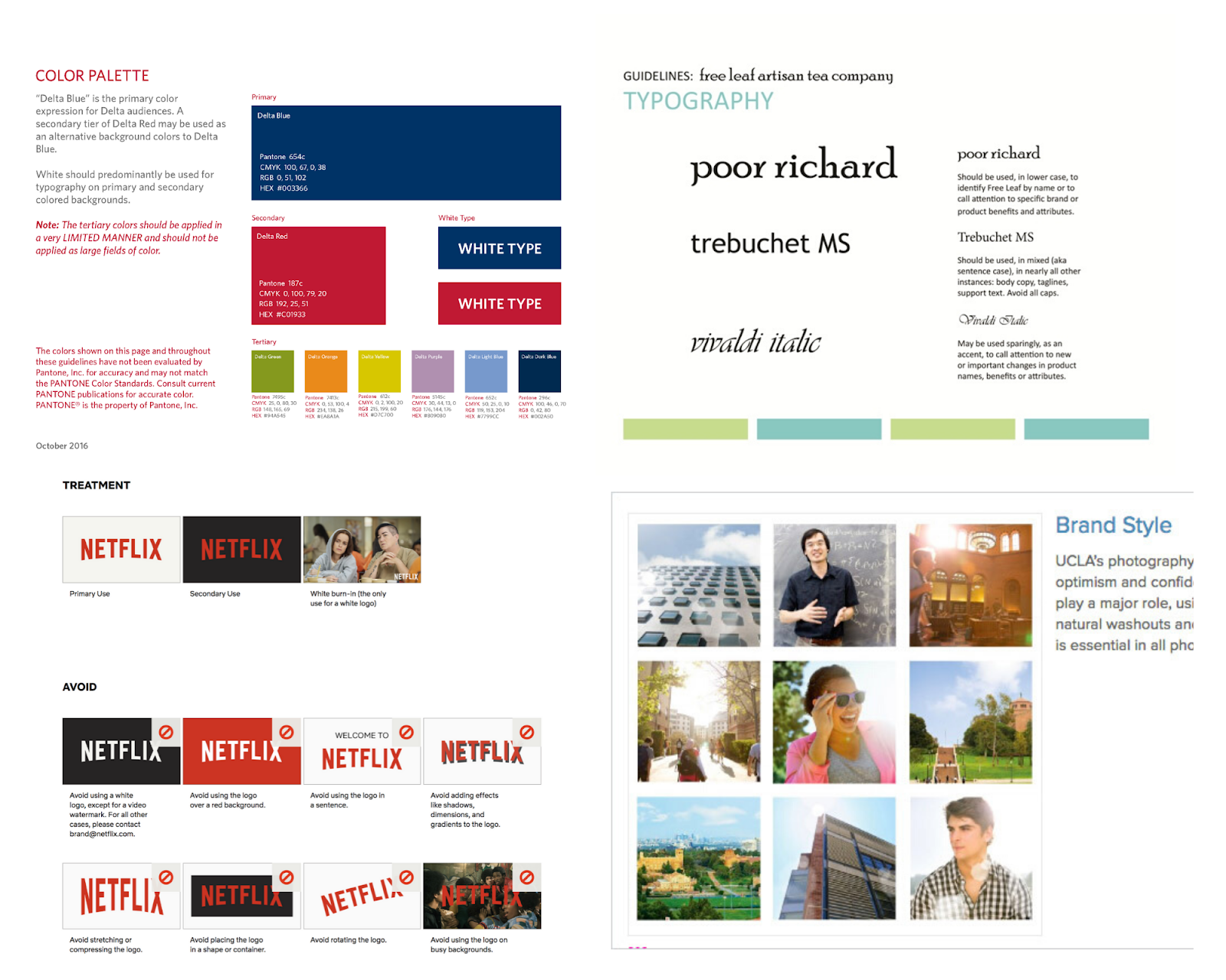
Here’s what brand guidelines generally include:
- Brand story
- Vision, mission, and values
- Logo guidelines
- Color palette
- Typography
- Image guidelines
- Voice
This is your opportunity to show how your brand should look and sound in the real world. Share your color palette and codes, give voice examples, and illustrate what you do and don’t want your brand to look like.
Why?
A brandbook is kind of like a blueprint for a house. It’s the basic model that gets to the core of who you are and what you do. Your designers can take these blueprints and build something real. They’re free to customize and get creative and iterate to infinity and back, as long as they stay within the lines of the blueprint.
Creatively experimenting within your brand’s colors, aesthetic, and voice is a great thing. Going off-the-rails with colors and typography is generally a bad thing. Rogue designs may look super cool but they also may not look like they’re part of your brand. Coloring within the lines, in his particular case, is the best possible thing to do.
Brand guidelines breed consistency across multiple channels. Consistency is crucial because it fosters customer trust. Customers recognize your colors and logo and voice, and they know who they’re dealing with, because your Twitter image looks just like your mobile app and your tradeshow swag, and they get warm fuzzy feelings thinking about your branded fidget spinner.
Consistency and trust are literally everything in a crowded, digitally-saturated world. Consistent brands are 33% more profitable.
You need to be the same brand on every channel, but you need to take a slightly different path to get there in print, video, social media, and other formats. That’s where channel guidelines come in.
Next level: Channel guidelines
Your brand’s typography, logo, colors and image guidelines may not change across channels, but your design process should vary for print, digital, email, and outdoor ads, socials, you get it. It’s time to take your beautiful brand book blueprint to a whole new level and get more specific.
Here’s a snapshot of what some companies’ channel guidelines look like for social media headers, print and video:
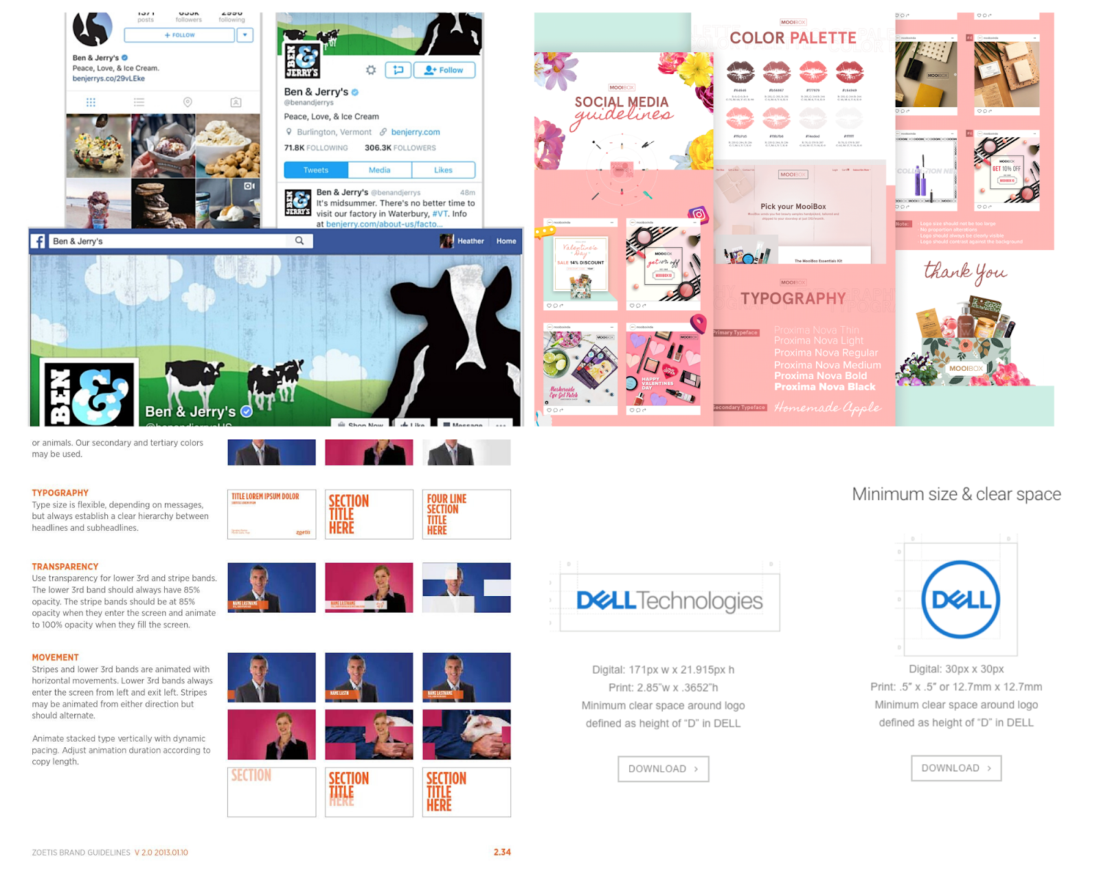
Here’s your opportunity to talk about channel-specific best practices.
- Audience personas
- Channel behavior
- Best practices
- Proofing checklist
The specifics are going to vary significantly depending on the channel. For example, your print guidelines are going to include things like:
- File formats
- Resolution
- Trim
- Side & bleed
- Paper weight
And, your web design guidelines are going to include things like:
- Grids & spacing
- Alignment
- Roundel
- Headers
Each channel guideline is the distilled brand customized for that channel. It helps guide how designers should spice up the brand, and perhaps bend the rules, for each channel.
Why?
You can get a lot more done if you create channel guidelines that answer designer FAQ. Like, the ideal DPI for digital offset printing. And the right image ratios for Instagram, Pinterest, Facebook, and Twitter. Putting channel-specific guidelines down in black-and-white means fewer errors and fewer FAQ on Slack.
This next level of hierarchy is, once again, about creating boundaries for consistency. You’re taking the big ideas from your channel guidelines and distilling these ideas into day-to-day templates your designers can quickly and easily use.
Third level: Templates
Design templates can add another valuable layer to the hierarchy. They’re like mock-ups of how your brand looks on its very best hair days when it’s on various marketing channels. This is your chance to show-and-tell your best looks for business cards, Slideshare, email, Twitter, and everything else you do.
Here’s a peek at some design templates from the wild:
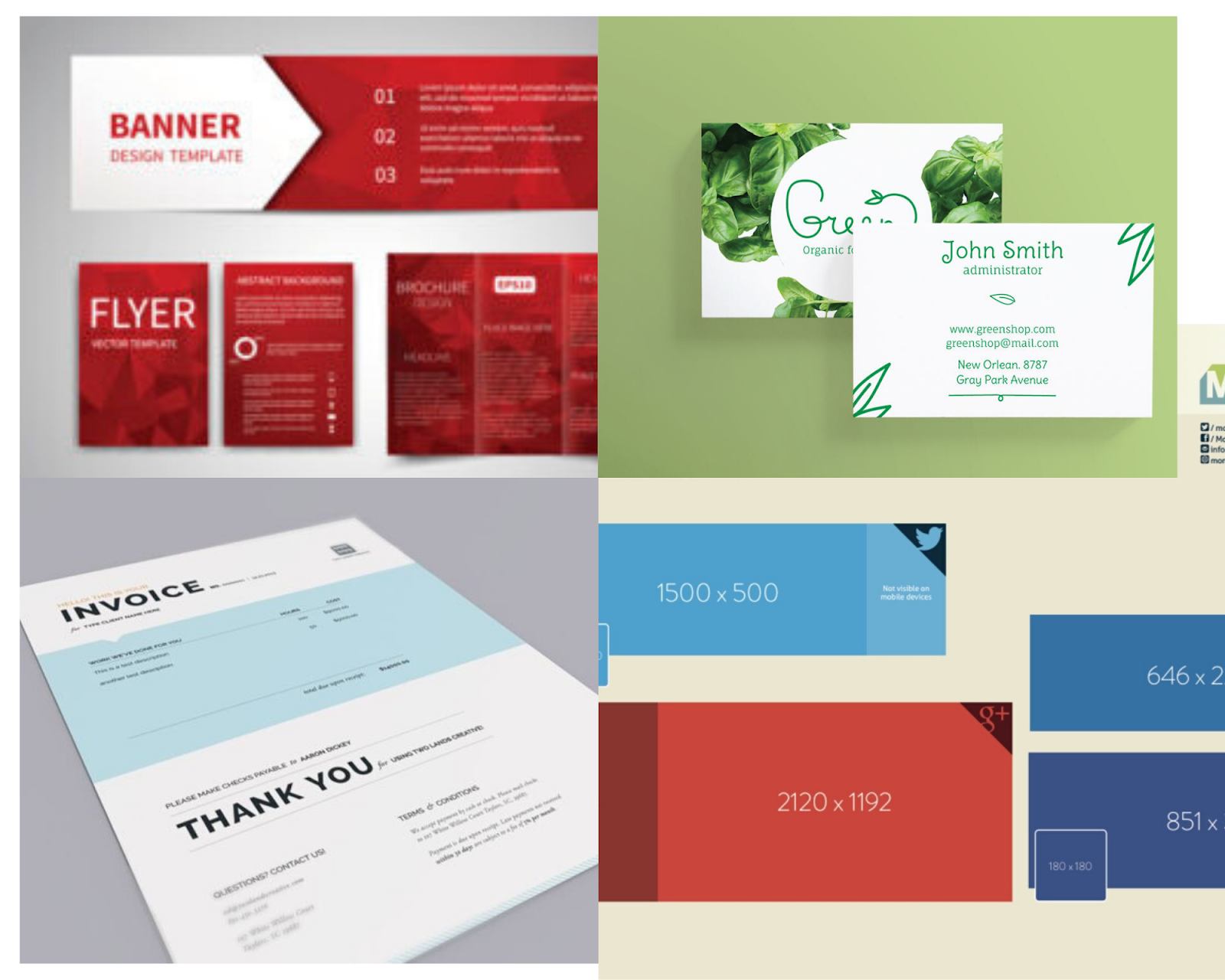
Basically anything can be a template. All you need is a design that meets brand and channel standards, then set it up for customization.
Why?
Design templates make your team fast and consistent.
These save designers the energy it takes to recreate the same social media graphic or email announcement from the ground up, every time. Designers navigate to the right template by channel and audience, fill in the necessary content, and they’re ready to send something to proofing, and then go live.
Design templates don’t need to be optimized by channel or audience. No one needs to tweak colors, resolution, or ratios. You definitely need a second set of eyes to look over your final design, but you may be able to skip a level or two of approval. Templates are a busy designer’s BFF because they’re already primed for success and proofed for errors.
Let’s imagine, for a minute, that you’ve been tasked with planning a live event for 2,000 people. You need to design all of the visual collateral for this event, and this is no small thing. We’re talking envelopes, notebooks, swag, kiosk screens, mobile apps, registration landing pages, emails, presentation templates, signage. And so much more.
You’re able to scale massive amounts of design quickly with a library of templates. The sky is the limit, and since you’ve saved so much time you can do like Ascend.io did and brand every inch of your events. Tabletop signs? Done, and the design file can be added to the template library.
Scale is possible when you’re working with a library of templates.
Finally: Actual designed pieces
Just like the legal system, design benfits from a library of precedents. Having a rich collection of previously designed work guides and inspires future work. Because the pieces are real, they provide an extra guiding hand to the designer about how they can create a publication-ready piece.
Here’s some examples of finished work from SketchDeck’s portfolio:
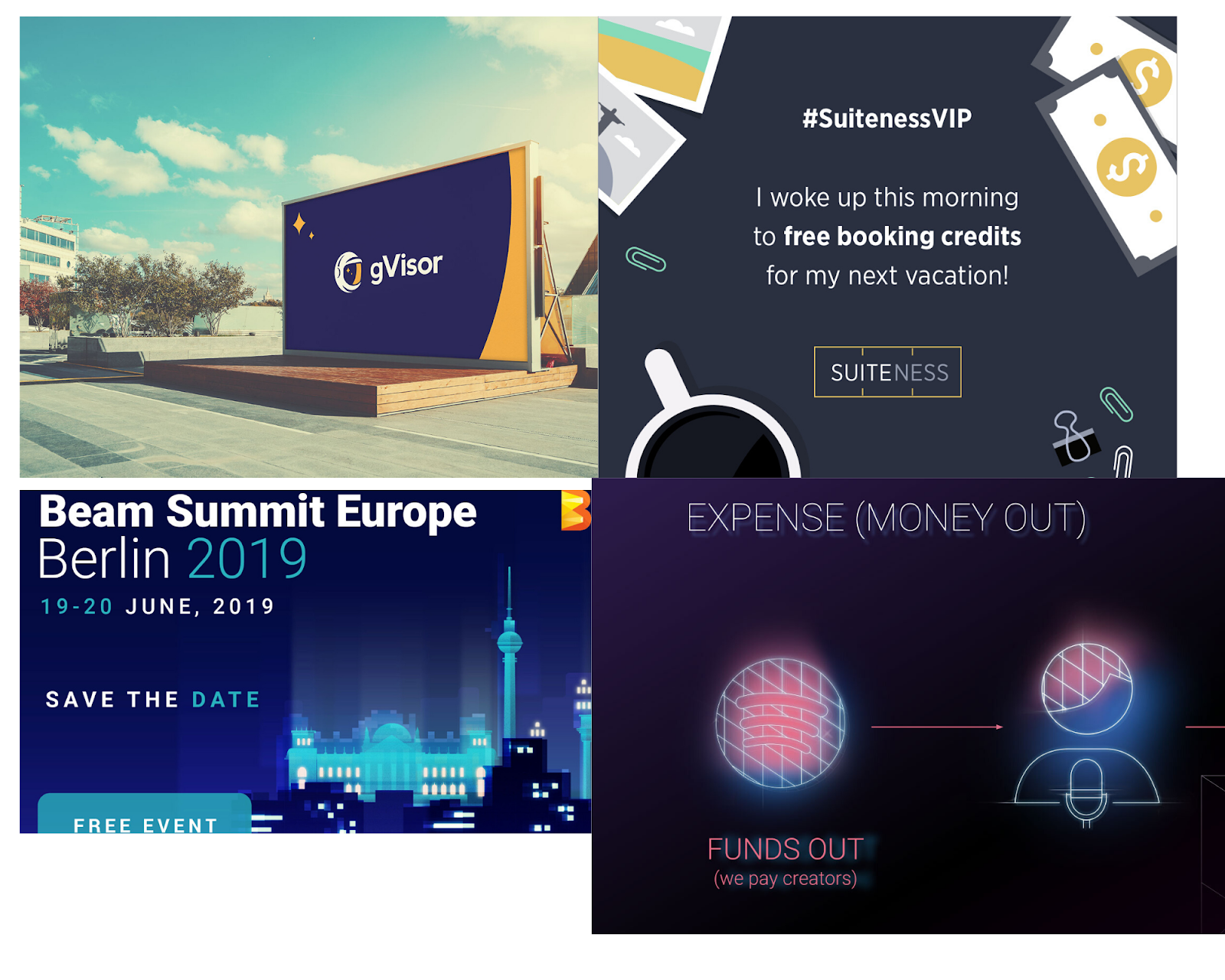
Let’s envision the design hierarchy in action.
Okay, let’s imagine you’re a project manager. You’ve been tasked to work with a marketer and a designer to create a multi-channel, digital marketing campaign to promote your new research report. You crack open your brand guidelines, channel guidelines, and drill down into the templates you need. You open up your library of design examples to pull out a few finished pieces for inspiration, based on a campaign last quarter that did especially well, because you’re an incredibly productive human being who gets stuff done.
You don’t have to re-invent the wheel, or figure out things from scratch. You’re set for success. You’re able to power through an on-brand campaign for a ton of platforms.
Of course in the real world, things are never perfectly organized. Design teams don’t work within a neatly-organized flowchart. You’ll never have all the pieces of the hierarchy up to date, and you’ll always be missing pieces. However, even an imperfect system is hugely beneficial to your brand and design production quality.
Tips and Takeaways
The design hierarchy concept benefits everyone operating at sufficient scale. Massive brands can use consistency to build trust. Small startups looking to get the most out of their design budget can work more efficiently with a library of templates. Everyone can dedicate their new free time to following their bliss in any form, whether that’s more hours at the dog park or exploring new marketing channels.
Just to recap:
- Digital is exploding. You have to be consistently great on a lot of channels at the same exact time.
- Sheer work ethic isn’t enough. You need a system to deliver at scale.
- Hierarchical design systems are a game changer. The secret is a four-level system of brand book, channel guidelines, templates, and a design library.
- We’re not promising perfection. Even the best design hierarchies get messy sometimes. But “sometimes messy” is a huge improvement over “always chaotic.”
We’ve worked on a lot of design systems and massive production schedules – if you’d like some help with yours, let us know.