
If you hear the words “editorial design,” the first thing that comes to mind is likely magazines.
However, editorial design is so much more than that. A subset of graphic design, its principles can be applied to almost anything: magazines, newspapers, books, newsletters and even online publications.
From layout to typography, editorial design has a significant impact on how written information is read and understood for years. In addition to the usual goals of being visually attractive and engaging, a primary focus of editorial design is to make publications logistically easier to read.
Today, marketers interact with editorial design through collateral like one-pagers, eBooks, landing pages, infographics and more. The design of each cannot be ignored–consumer decisions start with first impressions, after all, and over a third of survey respondents cite brand quality and image as the most influential factor in their brand loyalty.
As a result, it is important to consider not just the information going into each and every one of your marketing assets, but the way in which the information is laid out. We’ll take you through 6 guidelines of editorial design to follow when beginning to build your content. To start, let’s focus on the most elemental building block–the grid.
1. The grid system
Anyone involved in creative disciplines knows how critical “the grid” is, especially in terms of layout.
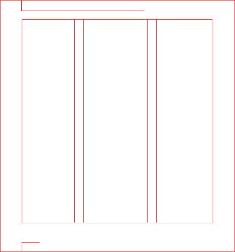
The best example of the grid system in practice? Newspapers! This beloved example of printed material is an excellent example of great design, incorporating both balance and hierarchy:

When it comes to designing collateral, a grid should be employed in each project created. We’re in no means suggesting everything should look the same or even like a newspaper, however–there are many grids that can be used, altering the overall look and approach of each.
Design was born from architecture. This means it’s about structure. I say that a lot, and I’ll say it again: the better the structure, the more understandable your design. There is a reason behind traditional layouts and grids.
Aislinn Barry,
Production Director
Two of the most common grids include the column grid, also known as the “editorial grid,” and the hierarchical grid, which is most often found online.
If you’re looking for how to start your next project, here are two of our suggestions for incorporating a grid:
- Be recursive: Use your personal creativity to develop and create grids in your designs. Whether you’re designing a web ad or a physical flyer, begin with a mock-up sketch. This will help you visualize how each grid will look before making a final decision.

- Be mindful of columns: In design, maintaining balance is key. Take a second and envision reading a magazine–a grid with several columns keeps the content organized so that you can easily consume the information, with text typically set in 5-7 columns. For business cards text is generally organized in 2-3 rows, and nearly every book you’ll ever read will follow a basic grid of one column. Use your medium to determine how many columns are applicable, if any, and work from there.

Need a little more guidance? You can find out more information about grids here.
2. Balance
Give and take, yin and yang–much like life as a whole, design needs balance. You could have an entire page of extremely creative, interesting content–but if it does not have balance, the individual pieces will not be received properly by the audience.
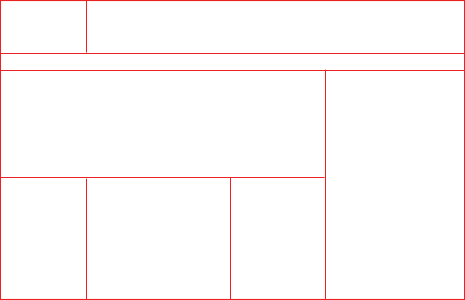
This example showcases the perfect balance between photos, texts, font sizes, and titles:

Balance should also be applied when creating collateral with multiple pages, such as the below example–one which sports an attractive and effective layout in terms of its balance and composition. The bright, eye-catching image on the left captures attention, while the copy on the right piques interest. Because of its effectiveness, this is a common layout that is used in nearly every type of magazine.

Need a helping hand with your layouts? If so, be sure to check out this editorial design resource.
3. Rhythm
Like a beautiful song, it’s imperative that editorial pieces have a sense of rhythm. Just as musical pieces provide auditory contrast, going through highs and lows to draw you in, editorial work must too offer visual contrast.
This is particularly true of white space. If you have a page that is packed full of text, you’ll want to follow with a page that is more light and airy–allowing the reader’s eye to relax with a full-page photo or even a well-designed collage.
This visual “break” allows the reader to pause, making their experience more enjoyable and immersive. This approach also enhances the productivity of your design–meaning that as you generate accents and utilize white space, the reader will be able to pay greater attention to the textual content on each page.


4. White zones
If and when you are able to design a page and have extra space, avoid filling every inch. Instead, let the page and layout breathe.
In fact, the last thing you should fear is an area without content–that void space is actually how you’ll create the perfect balance for the readers’ eyes. These “white zones” are effective for varying layouts and design concepts, and look particularly sharp when pages are black and white with small pops of color.

5. Hierarchy
When you’re designing anything, you need to consider what the most important component is, aka the key takeaway point for your audience. Therefore, ask this question before beginning: what should be the central focal point?
Once this is decided, you can effectively prioritize and organize elements, ensuring that everything makes sense. You’ll want each element to flow in a seamless manner, supporting that core focal point.

6. Readability
Always, always, always design with your audience and environment in mind.
You may not fit the target persona of your product or service, which is why you’ll want to obtain details about your final audience and design for them. What you uncover during your research will influence font size, font type, number of words per line and more.
You’ll also want to consider whether or not your final design will be digital or printed, viewed on desktop or mobile. Something designed to be read online will most often not translate well onto a billboard.
Here are just a few general ideas to apply to readability in different mediums:
- Traditional books are consistent in margins, columns, and styles (they use 1-2 columns maximum per page)

- Magazines geared towards younger audiences will showcase pages that have an average of 50 percent dense text-content and 50 percent visual content

- Mobile uses an average of six words per line

- For mobile, photos and videos tend to be more important than text

Takeaways
When you boil it all down, there are three main takeaways.
The first is to initially view your project as a whole. Think “big picture” here. Although there will be many different design elements, the project should be seen as a single piece–s a system.
Next, understand the above editorial design rules, but don’t be shy to bend or even break them.
Lastly, think as a designer, as well as a reader. Get this balance right and you’ll create designs that truly deliver.
Want our assistance in creating powerful designs that appeal to your audience?
