A logo is more than an illustration, company name, or chosen symbol—it’s branded semiotics, identifying and connoting meaning about the organization it represents. Alongside design, technology, or just about anything human-produced, logos change with driving cultural and social shifts. Each year we can see patterns in the updates made to company logos, and when looked at over a longer stretch of time, can even view the branded symbol as a bit of a funky, corporate time capsule.
Less is more: Today’s logo
The last few decades have come to signify global connection, the demise of the boy band, and most notably, unprecedented technological leaps and bounds. Most importantly for the logo, the last few years have seen mobile web browsing and advertising skyrocket, reaching a tipping point in 2015 where mobile internet usage time surpassed desktop.
As desktop browsing takes a backseat to mobile—not to mention other devices—simplicity is becoming the logo’s highest currency. Flat, minimalist design allows for faster load times and clarity on smaller screens, and as research shows is more recognizable and memorable for today’s consumers.
What came first, the minimalist logo or mobile browsing dominance?
Stripped of any fluff and all things ornamental, at the heart of minimalism is function. Minimalist logo design is being repeated time and time again as major brands become aesthetic reductionists. In fact, a quick review of the 20 corporate logo changes Business Insider reported on in 2015, reveals that more than 50% of brands lost one or more element (such as a border, icon, or secondary color) in their redesign. This isn’t to mention marketing powerhouses like Google or Facebook who didn’t cut down on elements, but simplified their typeface.
B2B and B2C logo evolution
Let’s take a look at major B2B and B2C brands to see the ways in which their logos have adapted with the times.
Uber, 2016
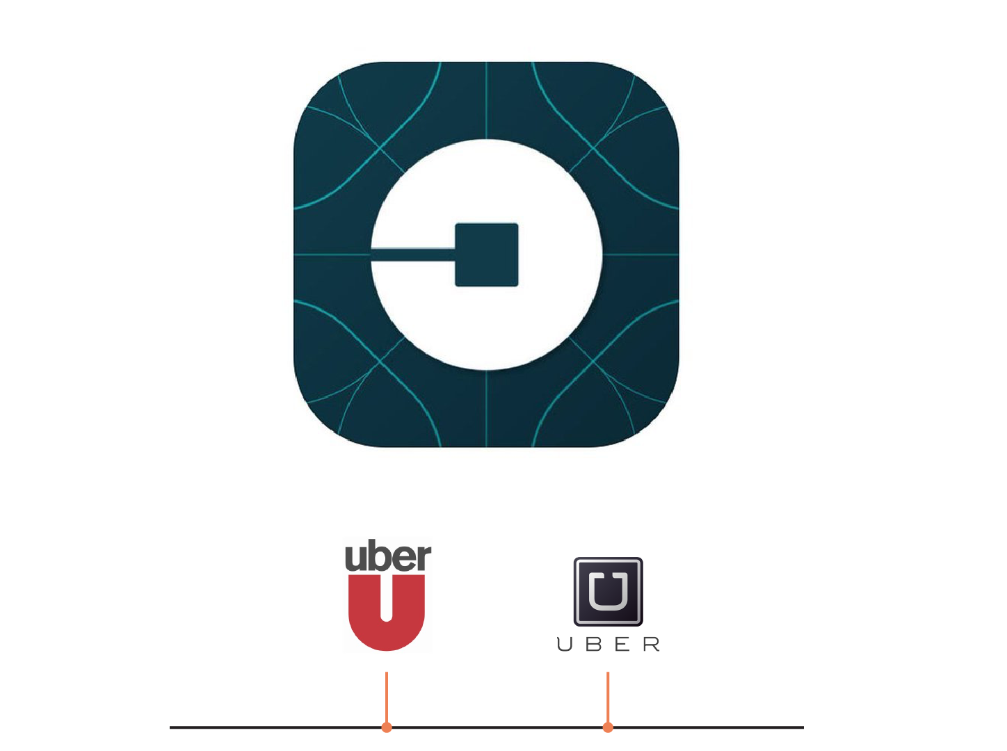
Although Uber has only been making taxi union enemies since 2009, the tech and transportation leader has just unveiled its second logo refresh. Taking enormous branding leaps with each iteration, the new logo—like Airbnb’s Bélo—is virtually unrecognizable to its former, confidently enforcing user adaptation. In favor of a more modern, flat, textured and unique design, the logo removes all typology, bordering and gloss.
KFC, 2015
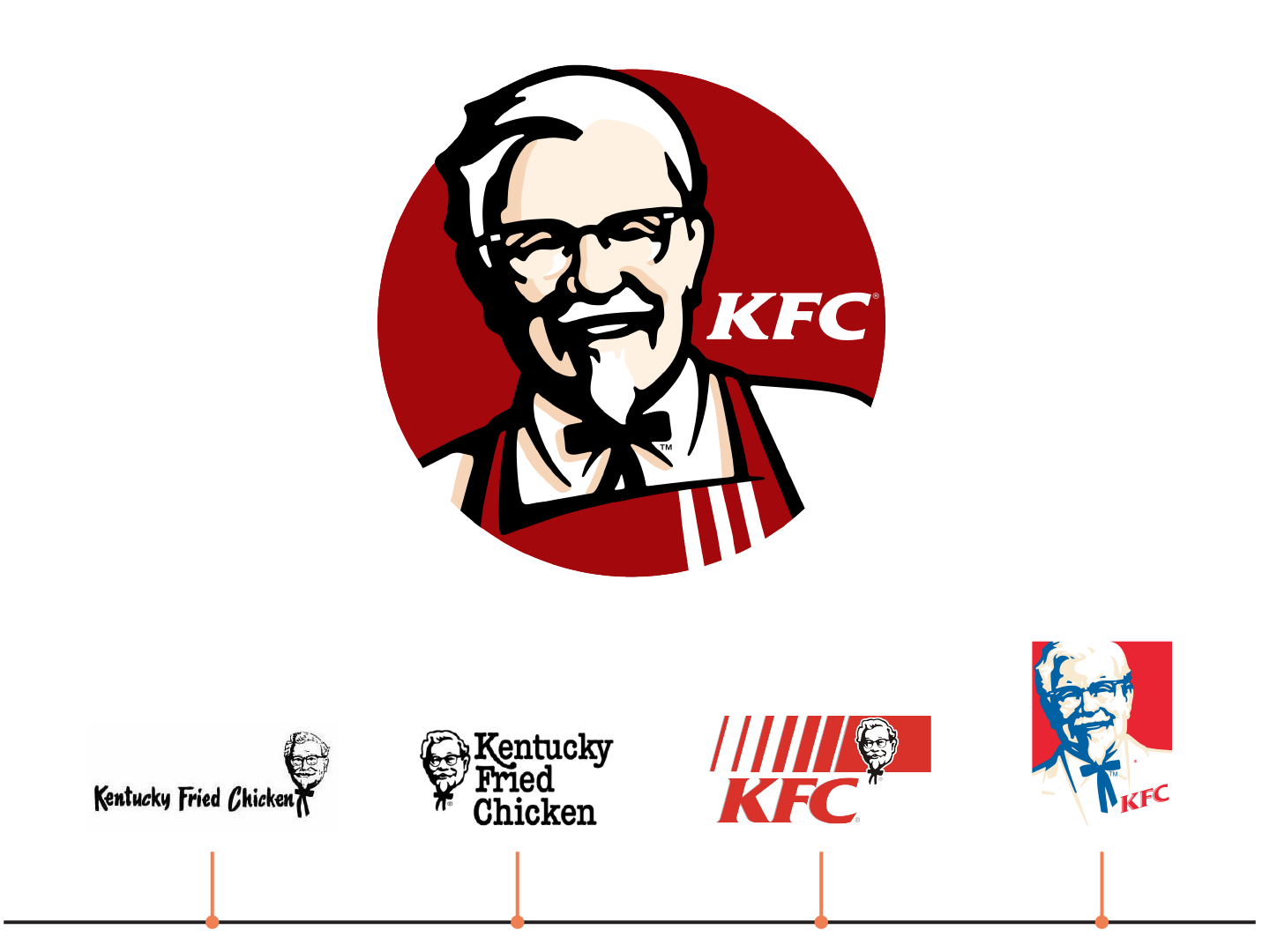
The 2015 redesign of the KFC logo is a playback to the original 1952 grayscale design with its added modern simplicity. Completely stripped down, the new logo eliminates all text and color, leveraging the use of negative space and confident consumer understanding of who and what the Colonel represents.
Coors Light, 2015
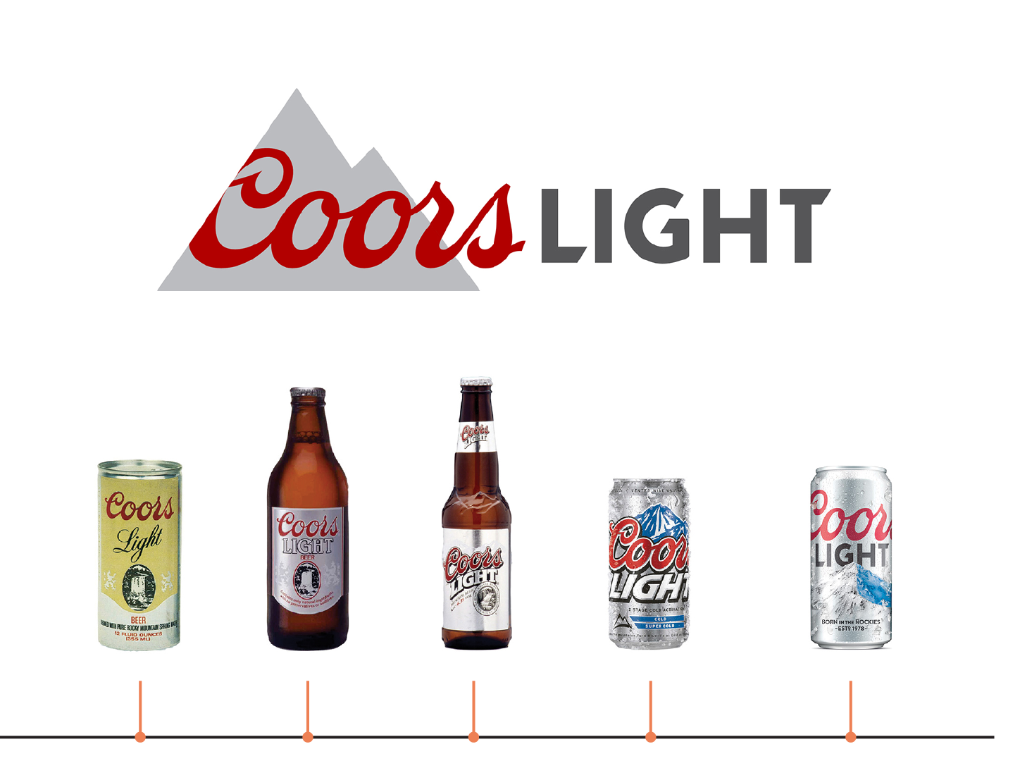
The new Coors design ditches all realism, opting for clean lines and modern geometric shapes. Simplifying the typeface and eliminating all borders and shadows allows the updated logo to pull off a lighter, more contemporary look with fewer elements. Being a light beer, the 2015 logo both illustrates and appropriately represents the product with ease.
IHOP, 2015
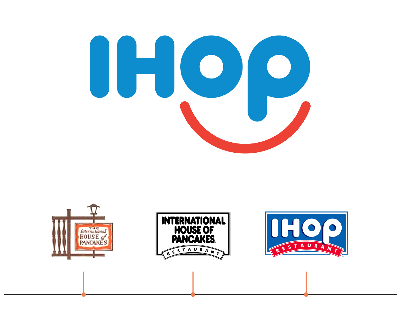
IHOP has literally “turned that frown upside down with their new logo”. Relying on widespread brand recognition, the new logo removes the word “restaurant” and inverts the red curve. This tweak cleverly incorporates the same elements customers are used to seeing, while making the logo more versatile and unique. Despite keeping the same typeface as their previous logo, IHOP separates new from old by embracing flat design and inching closer to the “Google-style logotype” territory.
Starbucks, 2011
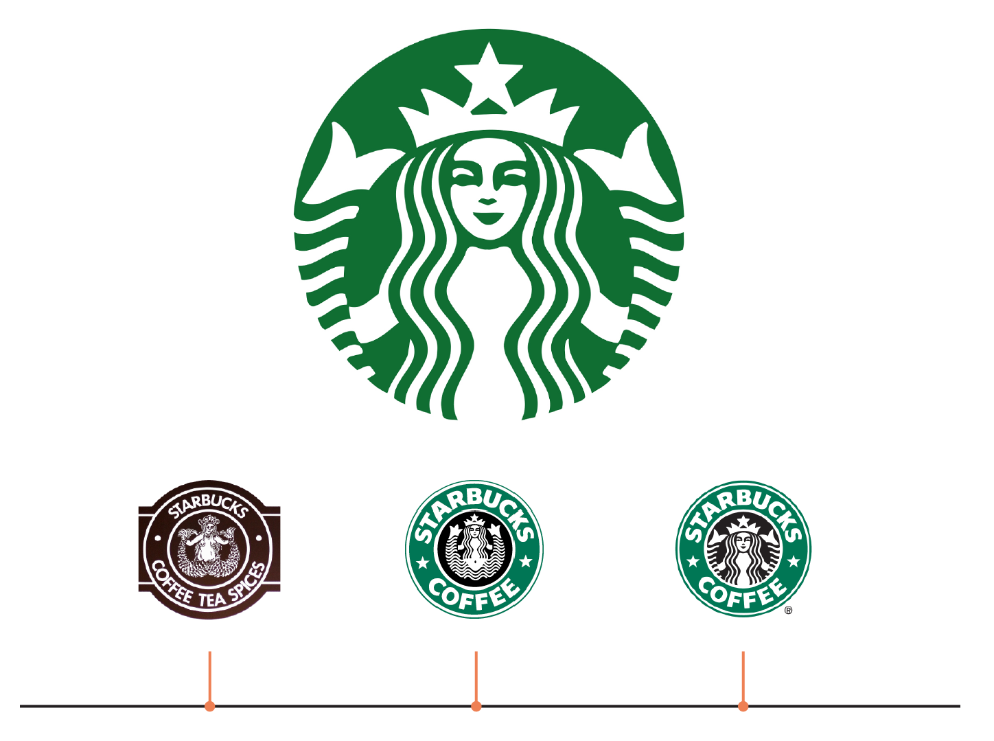
Starbucks, although more ornamental than most big brand logos, well illustrates an evolution in simplicity. From the 1970’s through to the 2010s, each updated rendering shed more unnecessary detail. Utilizing negative space, balance and symmetry, as well as monochromatic use of their branded “Starbucks green”, the B2C chain lets the mermaid/siren/statue of liberty speak for herself as one of the most recognizable and memorable logos.
Logitech, 2015
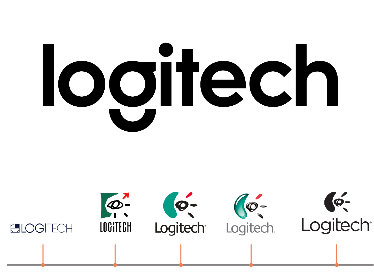
The 80’s and 90’s came and went, but up until last year, Logitech held on to their “hand-drawn” moon and sun logo. Reminiscent of something whipped up in a first-ever computer illustrator program, we can’t say we’re sad to see it go. However, the new Logitech logotype is very much on trend using a modern sans serif font, adding a stenciled design element, and finally letting clean, simple design do all the talking.
UPS, 2014
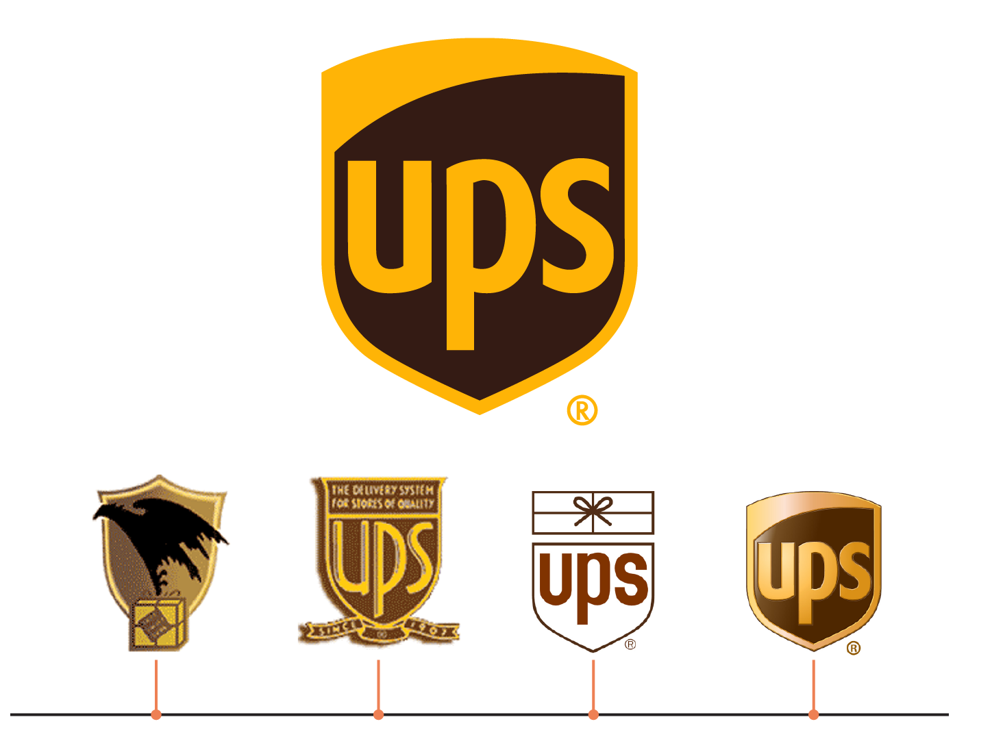
Last year’s update to the 2003 logo is a perfect example of how simple has become even simpler over the last decade. In the latest refresh, the UPS logo lost all shading, shadowing, gloss, and gradient. The result: a contemporary, flat crest, that focuses on the brand’s name and distinct, contrasting colors.
SAP, 2014
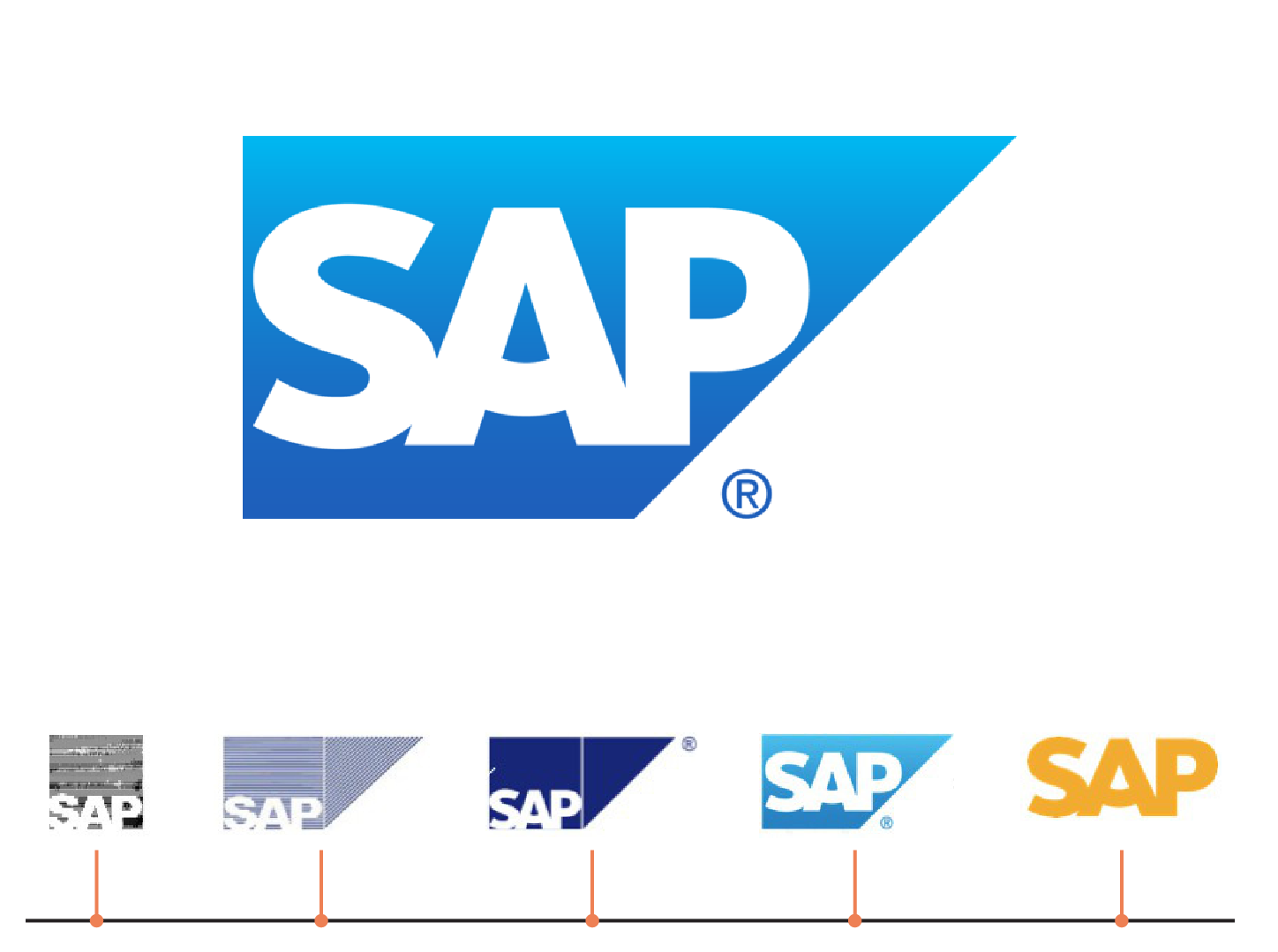
Although SAP seems to have reverted back to their 2011 logo, the 2014 logo was distinctive and modern in color-blocked gold. Using Ascender sans font, the temporary refresh included a cross-bar angle increase that emoted a slightly friendlier, yet confident side of the Fortune 500 giant. We liked it!
Philips, 2013
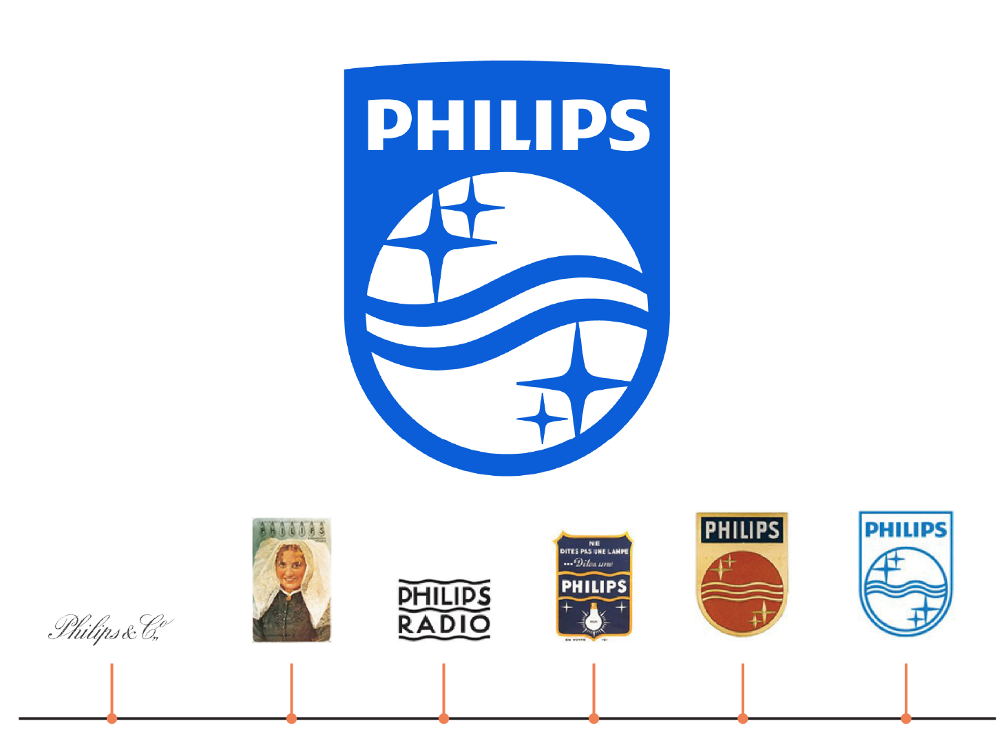
Philips has had over a century of logo redesign—from calligraphy and crests in the 1910’s and 20’s, to the introduction of a geometric logo in the 1960’s, through to today’s simplest, reverse color blocked logo. The current logo, last updated in 2013, amped up the boldness of color, while thickening and reducing the number of interior wave lines from three down to two. This is a fresh and modern adjustment to their evolving logo.
Tips for updating your logo
As the above B2C and B2B logo updates highlight, less is more. Cutting out the clutter to reveal a bare bones, minimalist design can provide the refresh your brand needs without hitting the risky logo “reset” button that many B2C’s—like Uber, Airbnb, Gap, Tropicana—do in an attempt to reposition themselves. As IHOP or Coors Light illustrate, hitting the sweet spot in a logo refresh doesn’t have to be boring, it just requires tact.
Strip it down
What do you like about your logo? Better yet, what parts of your logo help your customers identify you? Experiment by removing one or more elements from your logo (e.g. a secondary or tertiary color, shadow, border or any extra text) and explore the achieved effect. Chances are, you’ll be onto something.
Employ best logo refresh practices
If you’re going to update, don’t “pull an SAP” and retract back to the past. For early start-ups and new brands especially, choose clean, simple and minimal designs—it’s regret-free. Opt for flat, avoid using too many colors, add punch with a clean font (2016 is the year of sans-serif), and keep it versatile by getting rid of the fuss.
Change alongside something bigger
Changing a logo grabs public attention. What are you going to do while your customers are listening? Rebranding is generally tethered to product changes, a shift in target audience or an upheaval of underwhelming marketing efforts. For example, Starbucks removed the word “coffee” from their logo in order to, as CEO Howard Schultz said, gain “the freedom and flexibility to think beyond coffee”. Reading between the lines, this logo update signified change in the form of wider beverage and food offerings and international expansion. Be the change you wish to see in the world by updating your logo when you’ve got something to say.
Refresh mindfully
Most brands don’t have the influence (this is code for money) an Uber or Airbnb has to drive and enforce a radical logo change. If too extreme, like a bad asymmetrical haircut, the new changes can cause a revolt, wiping out trust and loyalty built. Take a page from Tropicana and Gap’s failed attempts to rebrand and do your best to ensure the changes are suitable, relevant, and something your customer or user base is willing to meet you on.
