Just as business and the funding process has evolved since 2015, so have the pitch decks companies use to convince VCs of their value. As a result, we’re taking a look back at older pitch deck lessons that remain valuable, in addition to introducing some 2020 themes that you should address.
In this article, you’ll discover:
- The data behind our decks and analysis
- Where to start your deck
- The length of successful seed and Series A decks
- Statistics on data and graphic usage
- The importance of a fast read
- ROI of a strong deck
- COVID-19 and other new 2020 realities
SketchDeck research and data
While some observations discussed in this article are based on reviews of recent decks and thoughts from industry leaders, the majority of the information discussed comes from original research we’ve conducted. The majority of our dataset is seed and Series A pitches–decks have been aggregated, sampled and then anonymized to ensure client confidentiality.
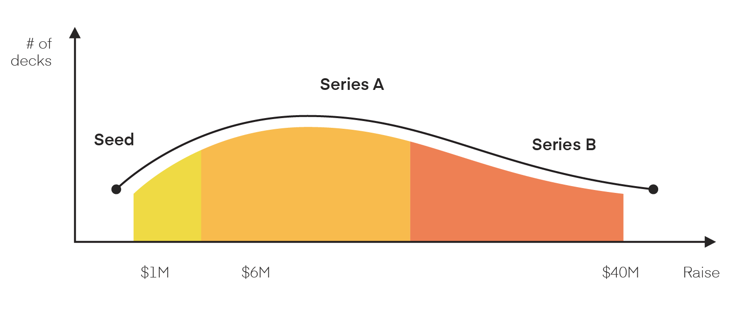
We’ve used publicly available information on fundraising outcomes for the companies we assisted, while keeping funding and other data broad in order to deliver insights while protecting clients.
There’s a lot to unpack, so let’s dive right into the lessons we’ve gleaned from working with hundreds of companies and multitudes of decks designed to raise capital.
Start with a value proposition and strong design
The first thing an investor will see about your company is your pitch deck. Poor design is a turn off for investors, it will confuse your company’s value from the very beginning.
Adam Roberts,
Co-Founder of Paid (YC S14)
Successful pitches’ first slide is often a company’s value proposition, otherwise known as the problem the company solves. This slide highlights the chief concern and value they bring in a clear, concise way.
As you introduce your value proposition, high-quality design can help you emphasize your point and/or examples. Use a clean layout to reduce clutter, and other elements such as visuals and text weight, size and color to emphasize points and keep the audience focused on your message.
This methodology helps your audience focus on what’s essential–the core takeaway for your slide. You can set the stage with the right design, like LaunchLab did with its deck.

So while there is no single “best first slide” or “perfect design” that every company should follow, there is a guideline: make sure that both set the correct tone for your pitch and communicate a story that is authentic to your brand.
Tell a story across slides
Having a clear deck that explains why you’re the right person to build your company, and why now is the right time to be successful, goes a long way to getting you a meeting.
Russ Heddleston,
CEO of DocSend
Your first slide is only the start to the story about your company, the problem it solves and/or solutions it provides. In recent years, the story you tell has only become more crucial as investors are inundated with more places to invest, and have more time to wait for the perfect investment to come along. Your story not only works to convince them of your importance overall (a.k.a. why to pick you over competitors), but it also serves to tell them why to act now.
This is so relevant that many 2020 decks now even include a specific “why now?” slide designed to create urgency and push for a more immediate investment. The choice is yours–you can build out a separate slide or include it in your early value proposition. Either way, keep in mind that the theme and the reason for that urgency should be present across your other slides.
Be sure to include why your problem and solution is important, why you are the team that should be involved in the fix, and why the VC should act sooner rather than later. You’ll need to keep it short and sweet when in the seed stage–as you get more established, though, you’ll have a longer runway to do this.
Series A pitch decks are longer and use 3x more statistics than seed decks
We made sure [our pitch deck] was clean and modern, but all of our effort was in putting red pen to paper and editing down the story to the few, important points that made the business matter.
JD Ross,
General Partner of Atomic and previously Co-Founder of Opendoor
At the seed stage, companies are often still seeking product market fit and cannot go into as much detail about their businesses. By series A, however, companies are required to make a much more concrete argument for their future success. This translates into a deeper discussion of the state of their industry and overall need.
After all, as your business moves further along and changes, so does the case you have to make to investors. Investor demands will look different, as will their expectations for what you can do and when. This shift is one reason we’ve found that Series A decks are typically not only longer, but also have a heavier reliance on data. Companies seeking Series A tend to have had a little more time to acquire real-world data and statistics to further their discussion on need and solution.

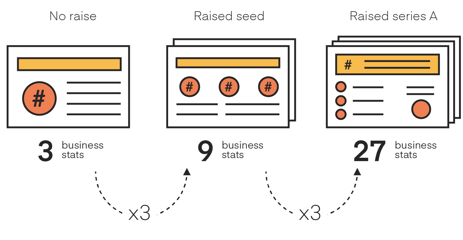
Expanding the discussion also increases the need for supporting arguments, so it’s no surprise that Series A decks have 3x as many actual business statistics as seed decks.
A 2020 note: Font size
However, an increase in statistics and content should not mean a decrease in font size. Cramming too much onto a single slide is not only distracting, but also gets in the way of your authority.
A good rule of thumb for slide decks is 30pt font so that text on a slide and the text on your graphics is easy to read. If you want more of a range, though, Guy Kawasaki offers up an algorithm to use:
Find out the age of the oldest person in your audience and divide it by two. That’s your optimal font size.
Dialpad represents a great example to follow–this slide makes it easy to understand their position at a glance. You can check out the entire deck we did for them here.

In summary: brilliant design is easy to see, use, and understand, making tiny font a no-no.
YC decks prioritize stats over words
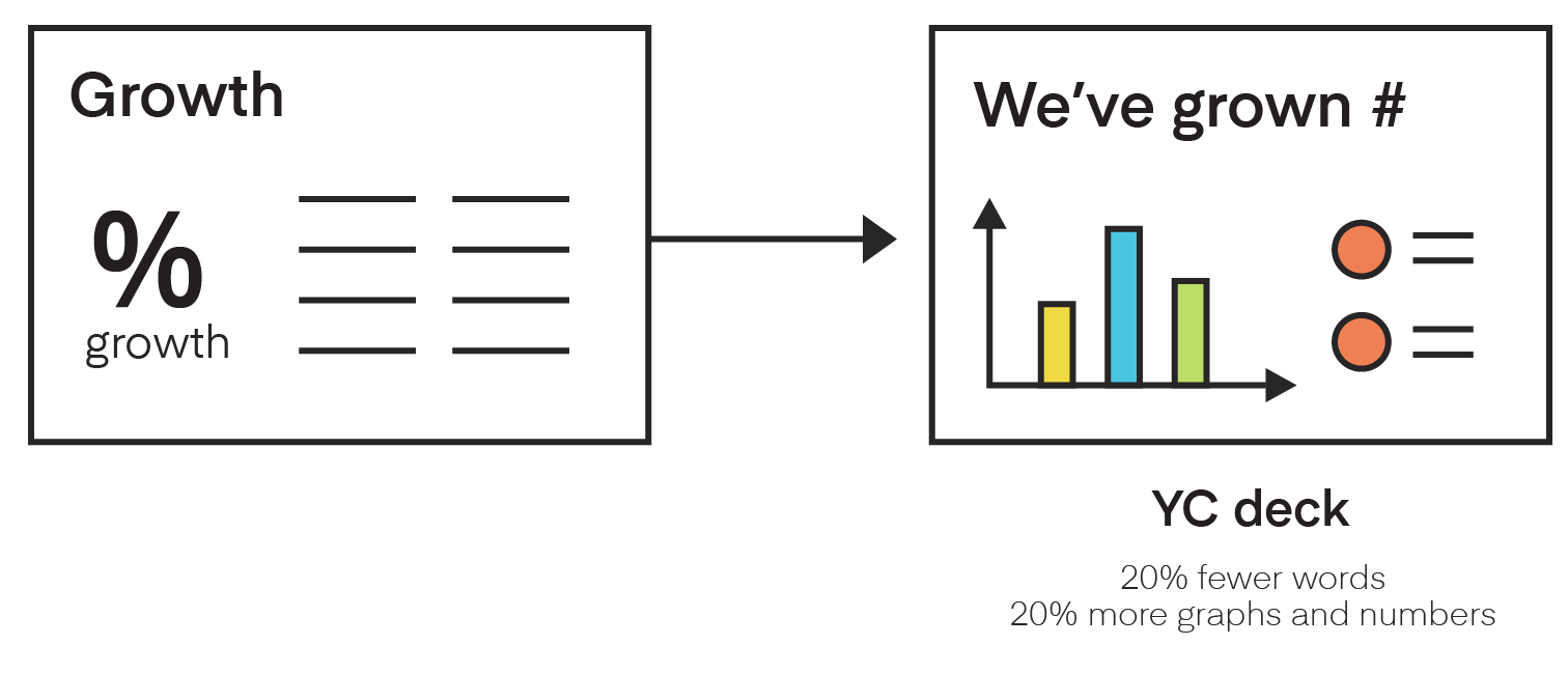
When reviewing our data, we observed that successful YC decks place an emphasis on being direct and using an economy of words. These decks typically had 20% more graphs and statistics, in addition to 20% fewer words. The graphs and stats conveyed a greater knowledge of growth and operations, as is crucial in the YC space.
Understandably, we found the trend most extreme in day pitches. In these cases, slides had almost no words and were often restricted to a single large statistic or graph.
Stay skimmable even at scale
The average time an investor spends on your deck is close to but under 4 minutes.
Hristo Odiseev,
CIO of Bertelsmann’s rtv media group
Industry experts and studies note that traditional VCs will look at your deck for less than 4 minutes before they decide if they want to meet you. Adjusting your message to be read in that amount of time will not only help you narrow down what’s most important, but it will also prepare you for fast-paced pitches. A “skimmable approach” to slides makes it easier to cut out clutter and tell a succinct story about your operations.
Use statistics and charts over words, adhere to large fonts and stick to a set cap on the number of slides–all of these tools will help you stay within this timeframe.
Need additional help simplifying your pitch deck? Try limiting each slide to one idea–it’s powerfully effective. See why:
A 2020 note: Single slide pitch
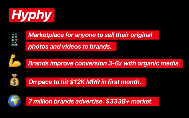
The coronavirus pandemic disrupted the 2020 Demo Day of Y Combinator, causing them to pivot to an innovative approach to fundraising. Keeping the attention of everyone at home would require something new and easy to browse–blurbs and single-slide summaries of every company.
Instead of videos and long decks, companies had extremely limited space to make their case. Just check out this summary slide for Hyphy, a marketplace for organically-sourced advertising media.
Read our full report on single-slide pitches.
The most popular (60%) primary color is blue
Times may have changed, but technology companies still love blue.
Generally pitch decks tend towards a conservative tone, but we’ve seen successful pitch decks in all colors and styles. Some series A decks we worked on used a lot of color, illustration, and interesting typefaces that properly reflected their brand and mission.
That said, blue has been a dominant color for the tech space for years. Marketing experts note that blue strongly conveys trust, and therefore helps demonstrate that a company is dependable and reliable. As a result, blue can help you appear like a safer investment.
Don’t forget color psychology
A pitch deck needs to tell a comprehensive story about your brand. If the calming nature of a blue design cuts against core principles or values, your brand may be better served with the creativity of purple, confidence of orange, or many other colors and combinations.
Spotify makes a compelling case for purple in its deck–the design feels cool, calm, and collected, just like a great album. Check out their whole deck here.
For a $2,000,000 raise, companies spend an average of $1,100 on design
As an investor, having a well-designed deck is critical. If I’ve never met the founders and a mutual acquaintance first put us in touch, it is the deck that acts as the first impression and hence, it is very important to make it count. A poorly designed deck makes me feel like the founders don’t take pride in their work. A well-designed deck is able to communicate clearly what the company is doing and why I should be excited to take the first meeting. So never discount the importance of spending time to get the best design possible for your deck. It will only increase the likelihood of getting in front of investors.
Scott Sage,
Venture Capitalist
Every single founder and investor we asked agreed: design has a positive impact on fundraising. A minimal investment in high-quality design services can yield significant gains, as it demonstrates that you’re taking the business and your investors seriously.

Design is a partnership, and getting the most out of it requires strong collaboration. Knowing how to communicate with your designer is of the utmost importance. If you need help, we’ve got some tips:
With that being said, design will not make up for inadequacies in the business or content. The first step to any pitch is building and refining the story. If you need help with your content, you can always reach out to us for help.
Address risk factors head-on
COVID-19 is not a footnote on an otherwise developed pitch deck… The goal is to articulate a business plan and model that works in what we hope will be the post-COVID world, but also one that is sustainable in the COVID-19 world of the next year to three years.
Dr. Robert Mittendorff,
Partner at Norwest Venture Partners
Perhaps most relevant for our 2020 review is the realization that every company needs to know how to plan for events like the coronavirus pandemic, even startups. It’s going to be asked or questioned, even if indirectly–and while minute details may be industry specific, there are also broad questions that apply to every business.
Decks should demonstrate that you understand not only that things have changed, but how–as well as how the past market performance may not fully indicate future projections.
Think of your customers and your team. If people need to be present in specific locations for your industry in general, address how you can move some efforts to mobile or digital platforms. And if you’re using a lot of highly sensitive data, note your cybersecurity experts on staff and consider using their brief bios as a place to highlight remote or work-from-home expertise.
Your response to issues such as COVID-19 and related impacts on your market or customer base is a must for investors to understand how prepared you are to mitigate risks.
Design support prepares you for the ‘big ask’
The best pitch decks we’ve seen are concise, beautiful, share their growth using numbers and charts, and remain true to their brand throughout. A good pitch deck both elevates your company and ensures that people pay attention.
Design can’t do the ask for you, but it can help keep eyes glued on you when you make it. High-quality design services can also help you stand out among the hundreds of pitches investors will see this year.
We can help you with not only designing your pitch deck, but the content too–we’ve turned our research into an additional area of expertise and now offer content assistance to help you build on best practices. You’ll get all the insight from hundreds of successful decks, plus access to design best practices and support that will emphasize your capabilities for your specific VC audience.
There’s a lot of demanding work involved in creating and refining a great pitch deck. If you’re working on one now, see how we can help you make your company’s perfect pitch.
