Design ties together the different pieces of a business into a bigger idea that sticks. It starts from the small things, from the logo and typeface you choose, to the way you organize your company. Each of these things are a trail of breadcrumbs that lead back to your company and amplify your brand, feeding back into everything from advertisements to case studies.
To distill what makes a powerful brand, we started from the breadcrumbs. We analyzed the brand guides of 50 different companies, from startups just making a name for themselves like Venmo, to established behemoths like Facebook and Google. This is what we learned.
We’ve aggregated this data from brand guides we’ve designed as well as external data. Although we break down trends, nothing here is specific to a single client’s brand guide.
A quick note on methodology
A brand guide—also known as a “brand book” or “style guide”—is the bible of your company’s brand. It’s a guide for how the world will see and understand you.
Brand guides are typically a variation of the following elements:
- A brief on the company, its mission, and its history
- Logo specifications
- Typography
- Color palette
They tell vendors, publications and even your customers how to use your logo and tagline—whether it should sit on a monochrome background, or only dark colors. They give your brand visual cohesion wherever it might live.
We separated companies into four categories based on size:
- Startup: Companies with between 0 – 250 employees
- Growth: Companies with between 250 – 1,000 employees
- Corporations: Companies with between 1,000 – 10,000 employees
- Enterprise: Companies with 10k + employees
We aimed for an even distribution of companies between each phase.
Enterprise brand guides are 3x longer than startup brand guides
When a company is just getting started, it has a logo, a couple of typefaces, and best practices on how to use brand assets. This changes dramatically as companies scale. The largest companies have brand guides with 3x the pages of startups and 8x the number of words.
The larger the company, the longer and more detailed the guide.
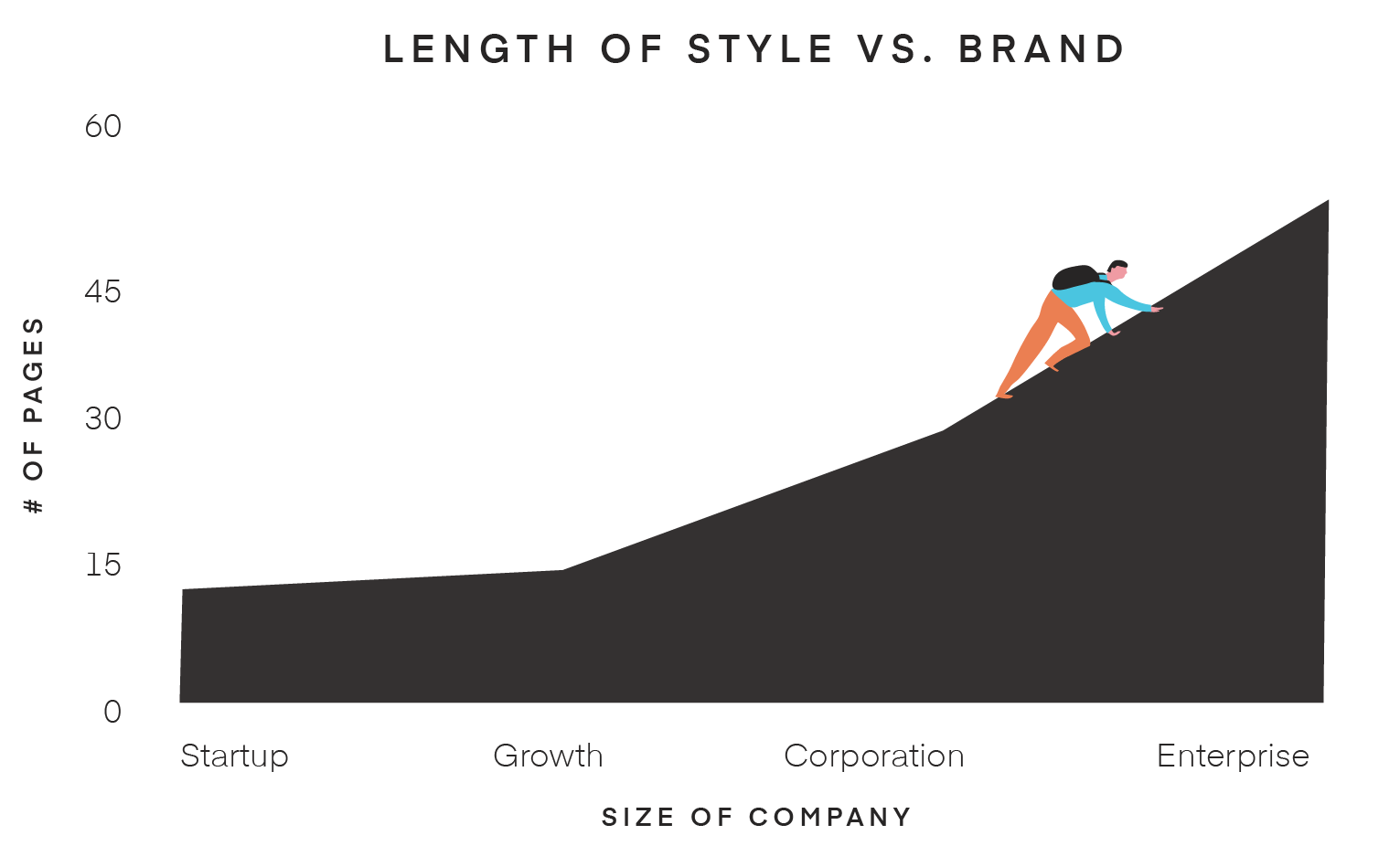
Of the companies we analyzed, Apple is the best example of this. The company has a 197-page guide completely dedicated to designing instruction manuals.
The comprehensive brand guide details everything from whether to hyphenate “circuit board” to how to use variables in text. The brand guide demonstrates the lengths that the company goes to deliver a unified experience and brand through all its products—including the instruction booklet.
Startups are 3x more positive than negative
But what a startup’s brand guide lacks in length, it makes up for in verve and ambition. This was overwhelmingly proven by conducting sentiment analysis on the texts. Sentiment analysis is a method of extracting subjective information, like emotions, from words.
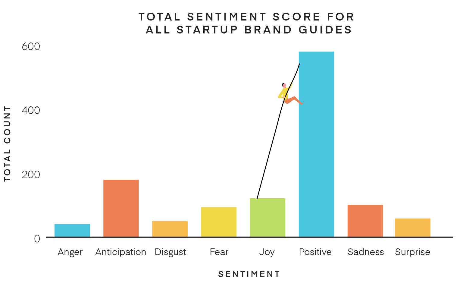
Texts that rank positively include high-valence words, like “enthusiastic” and “aficionado,” which add points to the sentiment score. Words with negative connotations, like “acrid” or “brutal,” subtract points. In our analysis, we found that startups use 3x the amount of positive words compared to negative ones.
You can get more granular with sentiment analysis and use it to gauge specific emotions. In the graph above, we see that startups rank the highest for anticipation, which comes from words like “advent” and “urgency.”
Startups don’t have a lot in the beginning, which is why they focus on their mission and the future to come. For example, Medium’s brand guide starts with a powerful statement of purpose:

“So our goal is to help people pay attention to the most valuable stuff first and to have the best ideas win.”
Rather than giving strict guidelines for where to place its logo, the guide simply places four words beneath the logo—“Understated, trustworthy, and reliable.”
While bigger companies often use brand guides to tell outsiders how, where, and what color a logo should be, a startup’s brand book leaves room to be filled in.
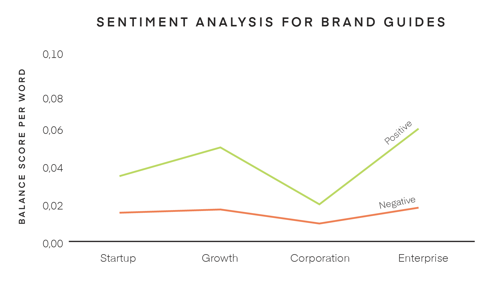
The enterprise isn’t (always) boring
When we think of the enterprise, we think the opposite of a startup. We imagine bureaucratic nightmares and endless boredom. Sentiment analysis of brand guides showed us the complete opposite.
While bigger companies use more legalese like “trademark,” “rights,” and “assets,” they also scored higher in our sentiment analysis on a per-word basis. A full 6% of enterprise company brand guides have positive connotations, compared to 3.8% for startups.
The best companies are never tedious when they describe design. Soundcloud (a corporation in our study) cheekily instructs designers that “a cloud needs air!” when describing how to use its distinctive cloud logo.
Cisco, a massive enterprise with 70,000+ employees uses its brand guide to contain the gravitas of its mission, and ends with a short sentence: “For best results, keep it simple.”

While startups leave blanks to be filled in, brand guides in the upper bracket of companies we analyzed are focused on their mission and purpose. But while the words can rank high when plugged into a computer, they sometimes ring hollow to human ears. When Cisco describes its font as “cross-cultural” and “cross-platform,” it’s hard to get excited.
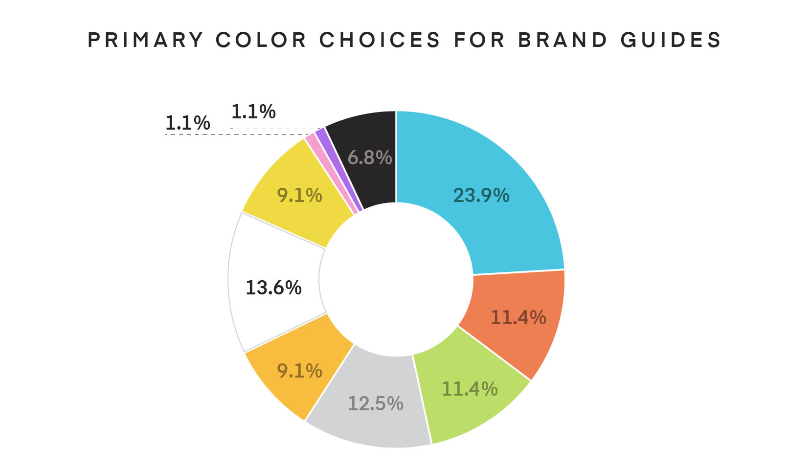
23% of companies use blue as a primary color
Tech companies love blue, a fact that we originally discovered by designing 200 pitch-decks. Blue was the most popular color at the Startup, Corporation, and Enterprise stage.
A study on the psychology of color demonstrated that consumers are more likely to trust brands that have adopted blue as their color of choice. Blue gives off an impression of stability, while the color red provokes excitement.
Here is a pie chart with the most popular colors for all companies.

Skype is a company that’s known for its trademark light blue, and it strictly enforces this choice of color across all brand assets.
The beginning of the brand guide points out that, “You wouldn’t wear one blue and one orange sock. Take a moment to think about how you apply the Skype logo.”
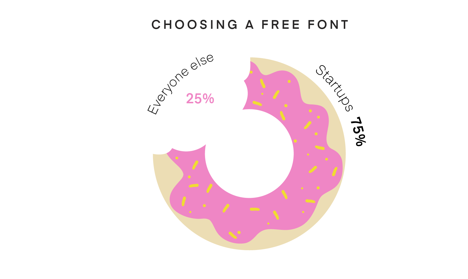
Startups are 4.75x more likely to choose a free font
56% of startups opted for free fonts available on Google Fonts, while 68% of companies at every other stage shelled out money to services like Typekit and Fonts.com. Startups choose fonts like Open Sans and Lato that are available for free and optimized for the web.
Companies that have more cash to burn, however, aren’t always more creative. 20% of all companies stuck to Helvetica for their font face, making it the most popular font across company stages.

Parallels, a company that provides hardware virtualization software, uses the Helvetica font family due to its “universal acceptance, legibility, and range of font weights.” The way that the company describes this choice in its brand guide mesh with the company’s larger mission of “efficiency and optimization.”
Scale design with your brand
KPCB’s 2016 design in tech report shows that customers are 6x more likely to make a purchase following a positive emotional experience and 12x more likely to recommend your brand to their friends. Design isn’t just a “nice-to-have”—it’s what will allow you to forge these emotional connections as you scale your business.
The best brand guides that we’ve seen aren’t the ones that are over-designed and chock full of rules. They’re the ones that tell a story.
Ultimately, this will make or break your brand. Good design isn’t about having a pretty logo you can splash across your marketing materials. It’s about delivering a cohesive experience for your customers and your audience.
